Web layout is an area in which I hope to delve into in my near to present future. For now, searching for inspirational layouts will suffice my creativity.
Here are a few to visually note:


Web layout is an area in which I hope to delve into in my near to present future. For now, searching for inspirational layouts will suffice my creativity.
Here are a few to visually note:


Why is the branding of a company so important? Among many reasons, people often tend to forget names of companies, however, the brand images or the corporate identity stays imprinted in their memories for a long time.Therefore, selecting the corporate identity is very necessary to find the perfect match between the corporate vision and the design selected. The design should convey the same message which is hidden in the mission statement of the organization. These designs are not only printed on the letterheads rather they are very much found on all official documents including the invoices, receipts, stationery, envelopes, etc.
Here are a few corporate identities that I find inspirational, clean, unique and noteworthy:
It’s always a good idea to have a range of fonts to choose from when designing. Typography is a huge design element when it comes to just about anything design related. I came across an article that feature a unique package of fonts. I can visualize some of these being useful and making an impact with select images and articles.
There are many reasons typography is essential to design. Beyond legibility, typography is used to convey a specific mood or feeling.
Here are a few fonts that make me think of things specific:


“Photographs are moments that are gone forever and impossible to reproduce.”
― Karl Lagerfeld
Photography allows you to savor cherished moments in time that, in fact, can never be reproduced. Vintage Photography reminds me of the age of those moments and that memories are of our past. Whenever I find an old photo I notice the crinkles and creases, the overexposed sunsets, the dusty shadows and sepia color tone, which can be graphically added to a photo, however isn’t as precious as the real thing. Sometimes we are inspired by things we cannot create, hence this post.
Do you have some experience with design but are looking to gain more experience and improve your skills? If you’re not ready to jump into the full-time design job but want to use your skills to earn income, then freelancing part-time is a great opportunity to consider. So get a pen and paper!
Here are some tips to think about before breaking in as a freelancer:
1. Keep Your Full-Time Job
Freelancing is a great way to start working in the design field and many people love to be able to set their own hours and work from home. But it is hard to make a living on and there is often more risk involved with depending only on a freelance income.
Without a full-time job there will be much more pressure to make money immediately, and pressure is no fun.
2. Set Up a Portfolio Site
Having a site to showcase your work is one of the best things you can do for attracting clients.
That is if you have some work to include in the portfolio. If you’re just getting started as a designer and don’t have many samples, then you may need to work on some projects specifically for your portfolio.
3. Experience > Income
As you decide on projects to pursue, place more emphasis on learning and developing your skills as opposed to just taking jobs that will pay you the most.
4. Establish a Work Schedule
Working a full-time job and freelancing on the side will require you to manage your time efficiently. Balance a work schedule that will allow you to stay focused on your full-time job but still give you time to balance your freelance work and your life in general.
5. Open a Separate Bank Account
For people that don’t manage their books very well, keeping track of income and expenses can be a challenge.
The easiest way to keep things separate is to set up an account strictly devoted to your freelancing income.
6. Talk Talk Talk
One of the best sources of business for freelancers (full-time or part-time) is word-of-mouth advertising.
7. Your Rates
Pricing your work can be a very difficult thing for new freelancers. In fact, even designers who have been at it for a while often struggle with determining how much to charge.
The most important thing to consider in pricing your work at this time is to charge a rate that you are comfortable with.
8. Don’t Take Too Much Work
One of the mistakes that some new freelancers make is taking every possible project that comes their way. Especially when you are getting started, you will want to be able to take all the time that you need to learn from the projects that you are working on and to produce the best work that you are capable of.
9. Network
Successful freelancers have an established network of contacts that they have established over a period of time. This may be other designers that you can learn from, designers that you can share referrals with, other professionals in related fields, or any other type of professional.
Designers,
We’ve all heard the phrase, less is more. Well in design, that couldn’t be more true. Especially when it comes to branding and logo identities. A ton of successful brands are known by their simple but very effective logos.
There are a couple of books that explain this idea in very close detail:
Just because the designs are simple, doesn’t mean there isn’t a lot of thought process behind it. Ironically, there is more time put into the design when you create something that has equal balance of power and simplicity.
Antoine de Saint-Exupery said: A designer knows he has achieved perfection not when there is nothing left to add, but when there is nothing left to take away.
For those of us who lack the years of experience, that’s a smart rule to go by.
Designers, particularly freelancers, wear many hats. Isn’t that so exciting?….Sure, but the reality is that it’s tiring and impacts your health. Isn’t that always how people say it goes, when your life is suffering, you’re doing well at work, and vice versa?
Well, there few tips that I found help me while I find myself on the edge of the cliff with stress. Managing work, life and family is a struggle.
Here are a few things to keep in mind to stay on top of your game, keep your energy levels high and remain productive:
1. Take a minute to breathe.
If you’re like most hard-working humans, you rarely take time to focus on nothing but breathing deeply.
That’s unfortunate because breathing exercises can stimulate your mind and body into a state of relaxation and recovery.
2. Set a balanced sleep schedule.
I’m sure you know that if you get better sleep, you’ll be more rested and will work more effectively.
It is very easy to let time slip away and suddenly you’re working into the wee hours of the night…….or morning.
Research has shown that if you maintain a consistent sleep schedule, then you will not only be more energetic throughout the day, you’ll actually sleep better.
Give your body the rest it needs.
3. Work in a healthy environment.
Are you slumped over on your couch with your laptop and a bag of Doritos nearby? Yeaaaa…. that’s probably not the best work environment.
Set up a work environment with good lighting and a nice desk chair that supports your back. Make sure you put yourself in a position to do good work for the entire day.
4. Work based on energy, not time.
Time is a standard. We can’t speed it up or slow it down. But energy can be managed.
You should typically work for about 90 minutes and then take a break. Then go for 90 more minutes and take another break. This block-scheduling will help maintain your energy throughout the day.
Source: http://www.freelanceswitch.com
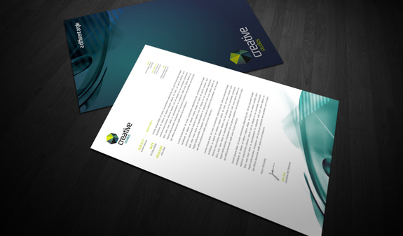
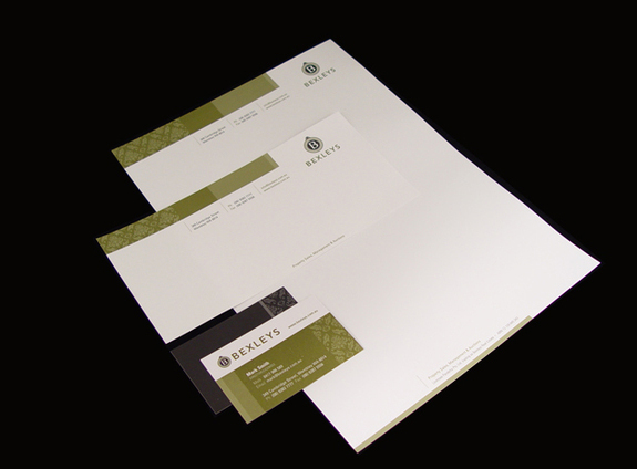
How important is it for a business to communicate its messages to potential partners and customers? Very. And what graphic communicates a business’s message and uniqueness?….The logo.
Which is what brings me to point some characteristics of badly designed logos not only on websites, but in the overall creation of a business’s identity.
1. Amateurish design
The point is that a professional website should look professional.
These are a few common reasons why many online business logos look amateurish:
2. Companies rely too much on latest trends
Trends (such as glows, bevels swooshes) come and go, eventually they become too BLAH. A logo that is well designed should be evergreen, and should stand the test of time.
Studying how logo designers work is particularly important in giving you inspiration to come up with a unique style of your own.
3. Contain outdated cliparts and stock art
Logos with boring cliparts are usually made by entrepreneurs who create their own logo or inexperienced designers, who are not aware that cliparts are so 90ish and just yuck!
A logo should be original and unique. Using stock vector images not only looks 90ish but it also may cause you to break rules. Chances are, those vector images have already been used by many people around the world.
4. The logo fails to match the website main subject
Ask yourself if this policy is really appropriate for your website? For example, stylish font may not be appropriate for the website of a lawyer office, duh!
Some professional designers also made the mistake of adding a “signature” in their work. Incorporating too much personality in a logo can be very bad. Stay focused and stick to the website’s main topic.
5. Too complex
Very detailed design won’t scale nicely when displayed or printed in small sizes. KEEP IT SIMPLE! Thumbnails are like fingerprints. You will notice the fine details of your fingerprints by looking at them closely. The same goes for logo design.
A detailed logo carries more information and web visitors need to know. Which may cause them to have the need to stare at it longer rather than continuing to browse the site.
6. Poor selection of fonts
When designing a logo, you should choose a font that best matches your website topic. Often, a logo fails completely, because it has wrong fonts (for example, the infamous Comic Sans is used much too often on many websites).
So much of design is based on knowing typography and having the knowledge to make the right choices when it comes to fonts.
Poor selection of font happens because the decision-making process is not taken seriously enough. Many designers choose a font without giving it a second thought.
7. Uses too many fonts
You shouldn’t incorporate too much elements in your logo, it’s confusing…… enough said.
8. Modified from an existing logo
This could be the biggest mistake in logo design. Some designers find no harm in taking a logo from somewhere else and simply modifying it, NO NO NO! That is stealing! A logo should be utterly unqiue and your own!
When I found this article, I was intrigued and interested. This is a list of the 11 Most Controversial Magazine Covers that have kept people talking. It wasn’t a surprise to find that most of these covers “poked fun at” or imitated religion, which is ideally what make them controversial.
Have you ever heard the saying that any publicity is good publicity? Well in this case, I think that is somewhat true. Controversy is what sells in today’s time. Among today’s reality TV stars and celebrity scandals, people are so much after controversy that it doesn’t matter whether they are getting a positive makeover, or getting popular in a negative manner.
These covers have caused quite the commotion among the public, but also helped to increase these magazines sales.
First, the Rolling Stone’s cover of Kanye West posing as Jesus…. In the magazine’s description of this cover, it describes West as “full of contradictions” and “the most important new pop star of the 2000s”. It also said that he was a character who made the mainstream come to him, rather than the other way around.
Whether his music is great or not, that doesn’t mean people glorify him as they do Jesus (or their God of choice). I believe that Rolling Stone chose this image because of his belief in Jesus and some of the song choices that he has produced. They could’ve also chosen such a controversial cover because they wanted to ……create controversy. Whatever the reason, there was a significant purpose behind the decision. Like I’ve mentioned before, nothing in design is ever arbitrary.
Secondly, what were they thinking when The New Humanist magazine featured atheist Ricky Gervais in a pose as if he was crucified. There is no question why this cover is controversial. The star is posed with this arms wrapped around a microphone pole (with his wrists wrapped in the cord) and the word atheist word on his chest in what appears to be blood.
So why is an atheist posed as Jesus? Doesn’t that mock Christianity? In my opinion, this was a poor choice for a cover. The magazine could’ve shown his sacrilegious beliefs in some other way.
View more on this story at http://slodive.com/inspiration/magazine-covers/
Today I found some logos that really inspired me. It’s amazing how thoughts and visions are put together to create one concept.
A logo is very important to a company and its identity. Because we do often judge books by their covers. The perceived value of a service/product can make or break the company. The visual identity of a company is what builds trusts among their customers. It’s kind of like “putting a face to the name”.
Through finding these logos of inspiration, I discovered that often times, it’s the simple solution that is the best soultion. Although a lot of time and effort goes into collaborating when branding a company, sometimes you have to go back and ask yourself: What basic elements can I use to produce the simplest design.
So now you are back to the basics and all the complicated guru is out the window!
I’m constantly finding new inspiration, but here are just a few designs I found: